
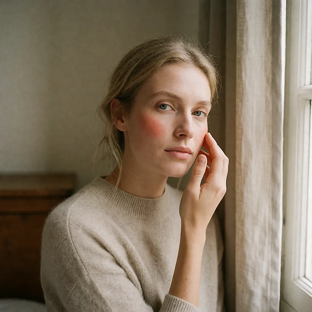
You've seen that coral shade everywhere. Three seconds of video, one glowing cheek, an instant desire. The parcel arrives, you apply it, and on your own face the coral turns brick. Whose fault is that? No one's: you simply bought a colour that wasn't designed with your skin in mind.
A colour never exists on its own
Blush doesn't sit on blank skin. It sits on a complexion with its own clarity, nuances and underlying colour. Colour theory comes down to one simple idea: a shade is perceived in relation to what surrounds it. The same very cool pink can look clear on a fair, pink-toned complexion and pull mauve on golden skin. The same apricot can light up an amber complexion and drain a very pale one.
There is also contrast. The greater the gap between your complexion and your hair colour, the more your face can carry strong, deeply pigmented shades. By contrast, an overall soft palette — light blonde hair, fair skin, pale brows — can easily be swallowed by an overly saturated powder. This isn't about taste; it's about balance between the values you place on your face.
In short, before chasing the shade of the season, look at what you already have in front of you. It saves a few disappointing purchases and a lot of powders left forgotten in a drawer.
Warm or cool undertone: a compass, not a verdict
You'll often read that you only need to look at the veins on your wrist. Blue veins mean a cool undertone; green veins mean warm. It's a clue, not a rule: how thin your skin is, the ambient light and the temperature of your hands all change the colour you perceive. The cues that hold up best day to day lie elsewhere. The jewellery that flatters you, gold or silver. The white that suits you, pure or off-white. The lipsticks you reach for without thinking, which often share a similar tone.
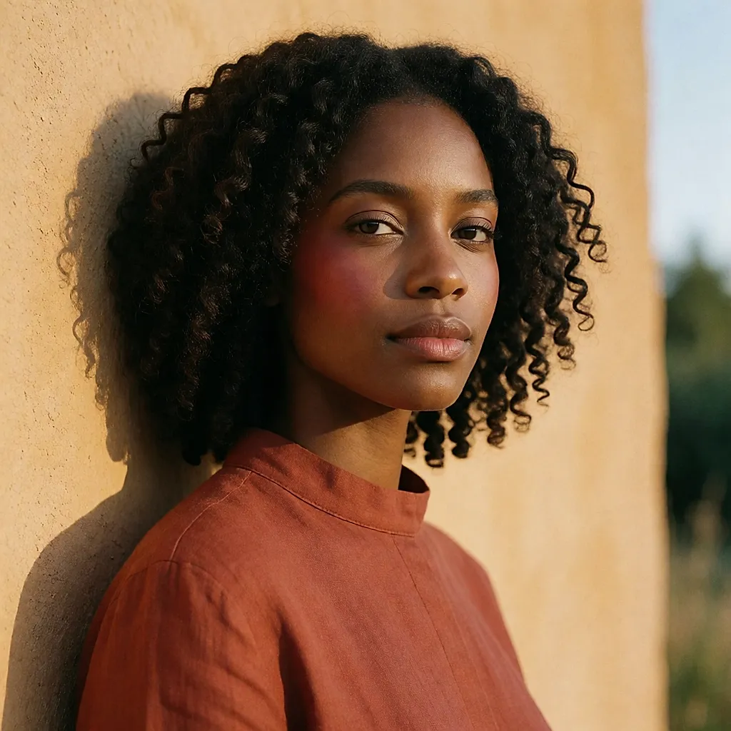
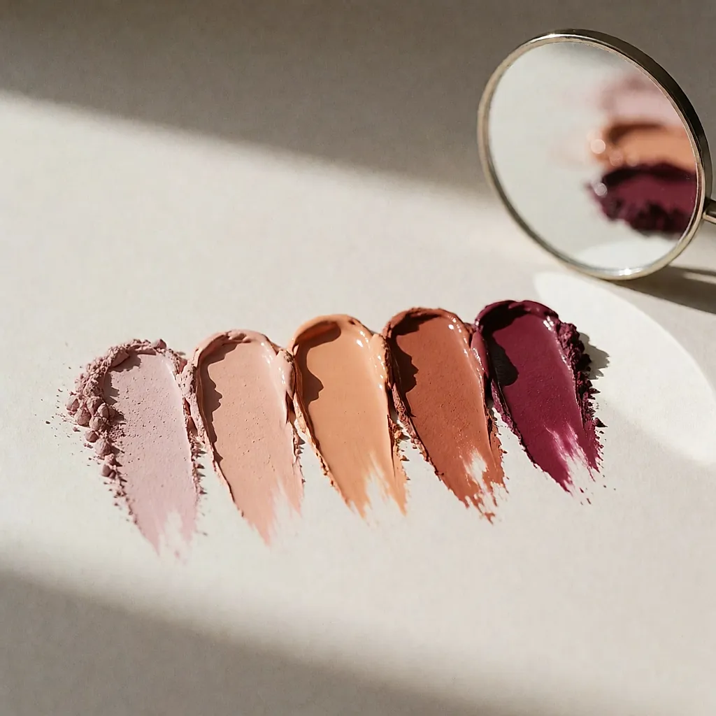
Then you translate. On the warm side, apricot, peach, terracotta and warm dusty roses blend in effortlessly. On the cool side, true pinks, raspberries and lightly diluted berries give a healthy glow without the 'I've just come in from the cold' effect. On deeper skin, a saturated shade that genuinely shows up — on screen and in the mirror — is better than a pastel that leaves a greyish veil: the colour needs enough body to be seen.
All of this is still a compass. No one is a pure case, and you might be more neutral, warmer in summer, cooler in January. Nothing stops you layering two thin veils of a colour you like until you find the right intensity, rather than buying a third powder.
Powder, cream, liquid: texture changes the shade
The base matters as much as the pigment. Cream blush blends into the skin, can be worked in with fingertips and leaves a discreet finish, though it may become a little more radiant as your face warms over the hours. Powder, drier, lays down a crisp veil and often lasts better where your complexion shines. Liquid textures demand speed: they set exactly where you place them.
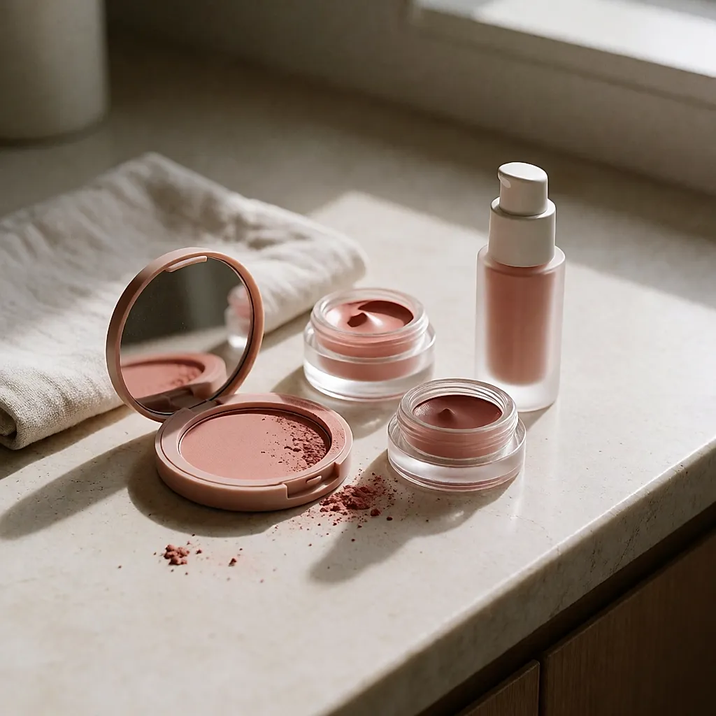
Then there's the skin underneath. On dry skin, a very matte powder can drag, emphasise small dry patches and make the shade look cooler. On combination skin, a rich cream can slip before noon. So choose your texture for your real face — the one you have on Monday morning, not the one from the day the light was perfect.
And how you apply it matters just as much. Tap, don't drag. A well-chosen colour applied in long streaks from the centre of the cheek towards the temple can look false; an average colour blended in with small taps often looks more convincing.
Budget
Blush has at least one virtue: you don't need to spend a fortune for a decent result. You can find perfectly good powders for around £5–£12 in supermarkets and high-street chemists, while beauty retailers and specialist beauty chains tend to sit between £15 and £35, depending on brand and format. A cream or liquid often comes in around £12–£30. These ranges vary with city, line and packaging.
When it comes to sustainability, refillable formats are often the most convincing: the case costs a little more the first time, but refills often cost less than buying the full product again. Also look at what surrounds the formula — a case you won't throw away after a few months, a clear ingredients list, a brand that is transparent about its pigments. But the best move is the one we forget: finish the blush you already own before buying another.
The most useful test is usually free. Apply the shade to the lower part of your cheek — not the back of your hand, where the skin is different — then walk for two minutes outside or near a window. The golden light of shop windows makes most of us look rosy, which is exactly why we buy so many things there that we later regret.
The best blush isn't the one that has done the rounds on every screen. It's the one that, on you, doesn't register as colour but as the complexion of someone who is well-rested. Start with your undertone, adjust the intensity with your application, and if a viral shade tempts you, go for it — in a small size, just to see. The rest is down to technique.


Comments
Your opinion matters: rate the article, react and reply to comments.
Comments are moderated; AI-assisted comments are flagged. Text emoticons (8-), :-), <3…) are automatically shown as images.