
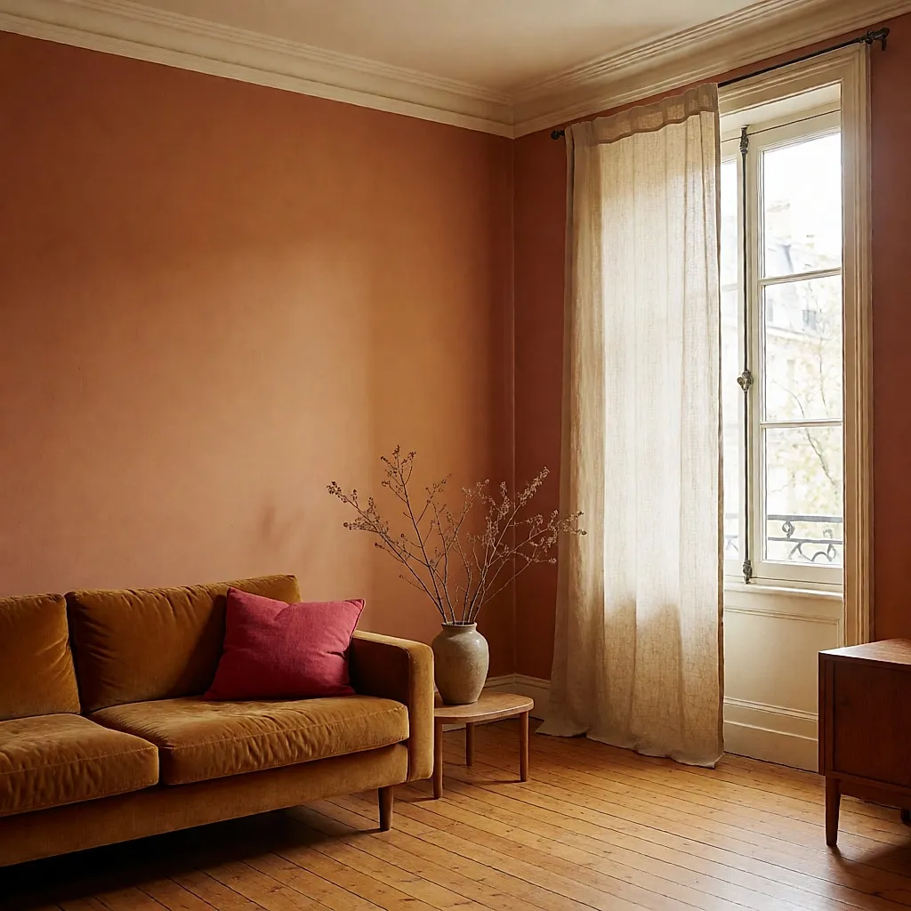
Colours shape how a room feels — and how you feel in it. Repainting is never just about picking a pretty shade: it's about deciding the atmosphere you'll live in, cook in, sleep in and welcome friends into. The same room can become an open, welcoming cocoon or a stifling one, a bright studio or a restful bedroom. And honestly, the change can be dramatic.
So before you reach for the roller, we've gone back over the main colour families, one by one. What we know, and what we don't yet know: when it comes to mood and sleep, current evidence suggests that context and light play the biggest part. Nothing magic, then — but some genuinely useful pointers to help you get it right.
Warm colours for living spaces
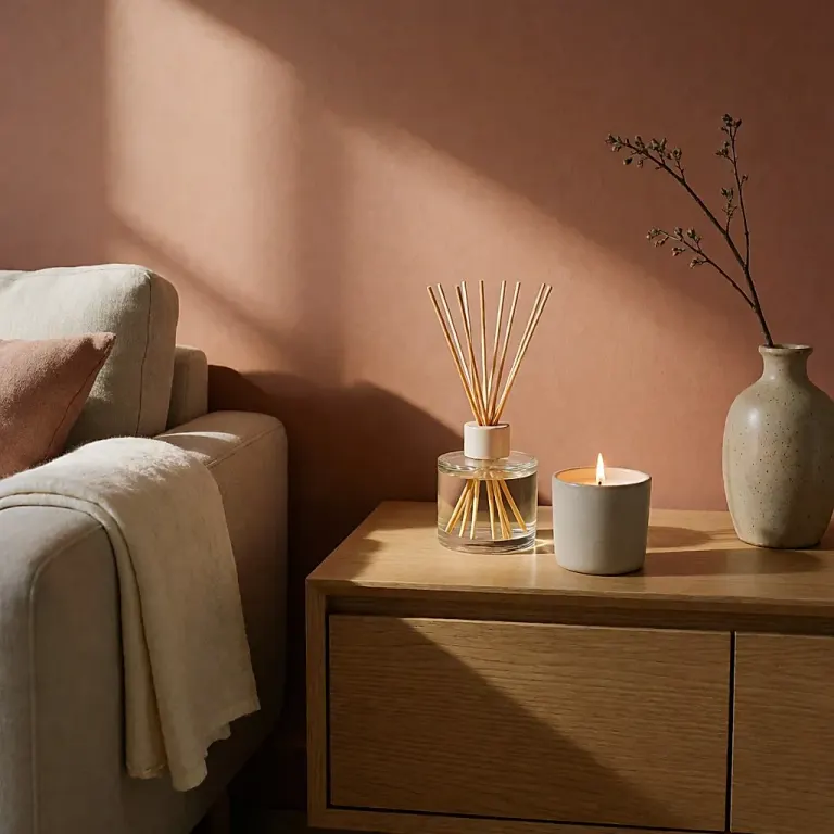
Red, yellow, orange, ochre, raspberry: these vivid shades share one thing — they heighten a room's intimacy and bring warmth and a sense of comfort. They work especially well in living spaces: the sitting room, dining room and kitchen. In practice, they warm the atmosphere and invite you to relax during long winter evenings.
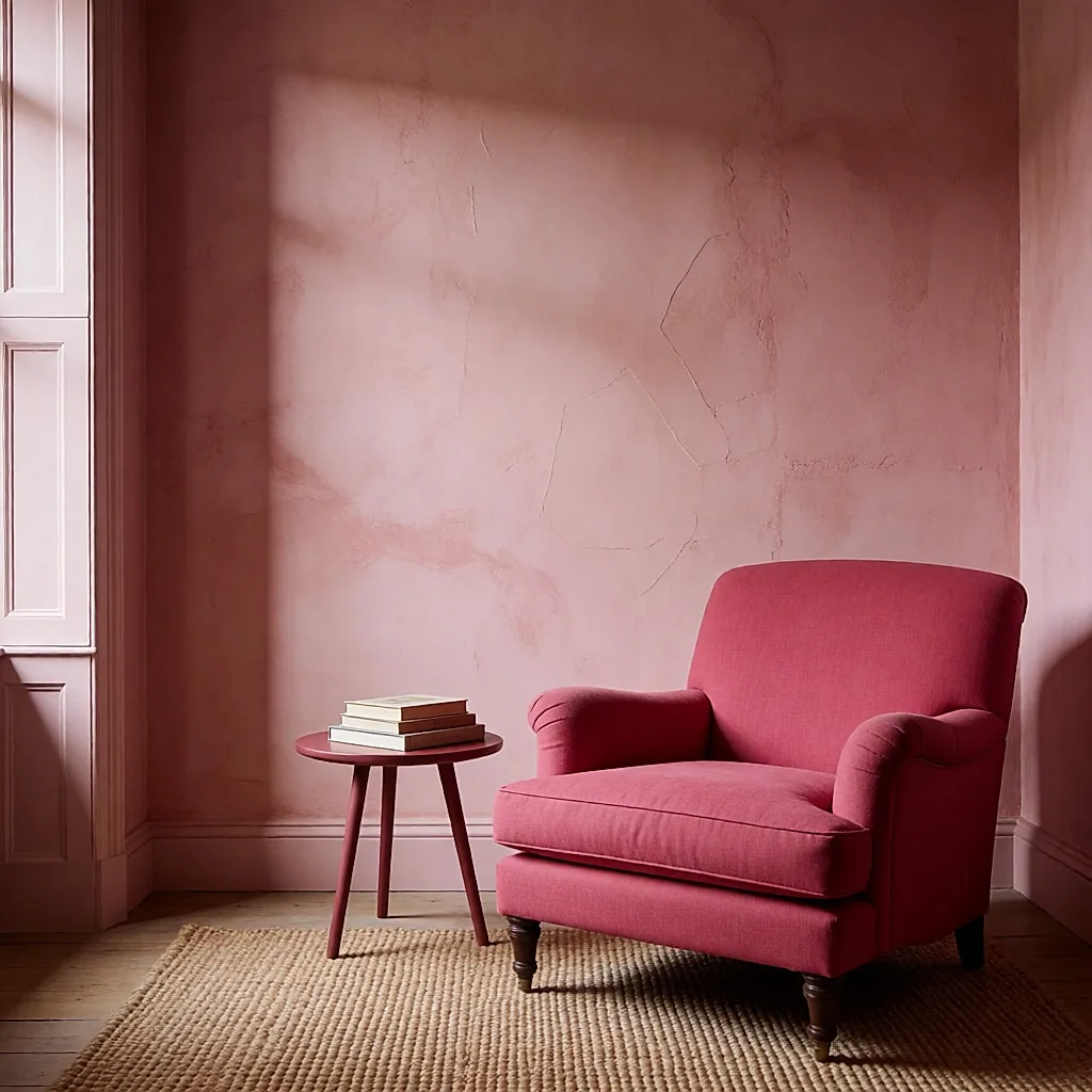
They also carry strong symbolism: fire, love, sun, summer. That's why they're so useful for brightening a dark room, especially north-facing rooms that get little light.
Another advantage: against light mouldings — white, beige or cream — vivid colours create striking, very elegant contrast. A contrast that holds up well over time.
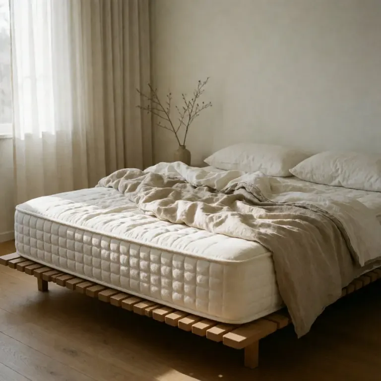
In a bedroom, however, some people find warm tones stimulating; the effect depends on the shade, the light and the context. That's not a small detail if you're trying to wind down at night: the room's environment is one of the factors that can support sleep, alongside a bedtime routine.
White: bright but demanding
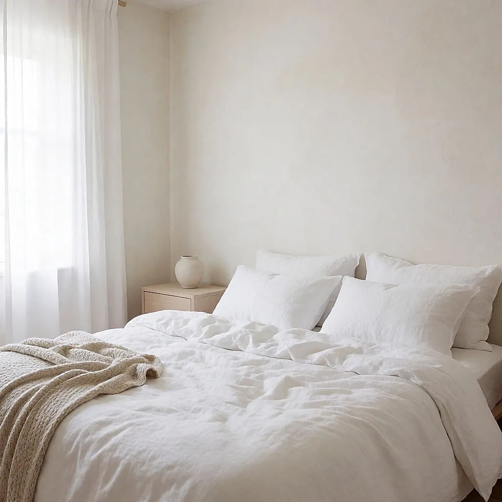
White symbolises clarity and purity. On its own, it makes a room feel considerably larger, giving it a vast, immaculate look — and sometimes it can emphasise a sense of emptiness if the room is sparsely furnished or decorated.
It's a cool, calm colour, much loved in Greece — where small white houses glow in the sun, inside and out — and by interior designers in the south of France.
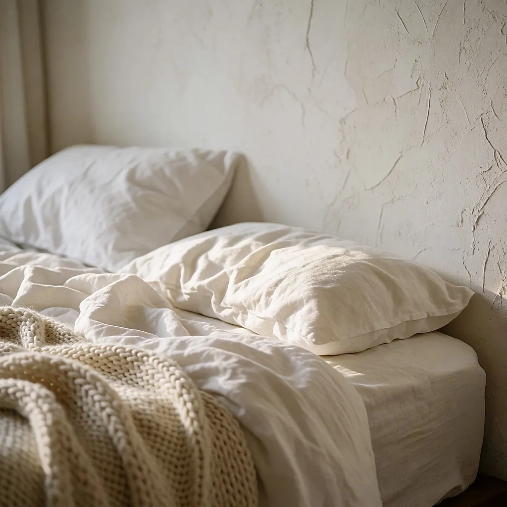
Be careful, though: in a kitchen or living room, white shows dirt and isn't the easiest to keep clean. In a bedroom, by contrast, it creates a serene, restful atmosphere. And it looks even better when you combine several tonal whites with beige, cream or off-white.
Blue: calm borrowed from the sky
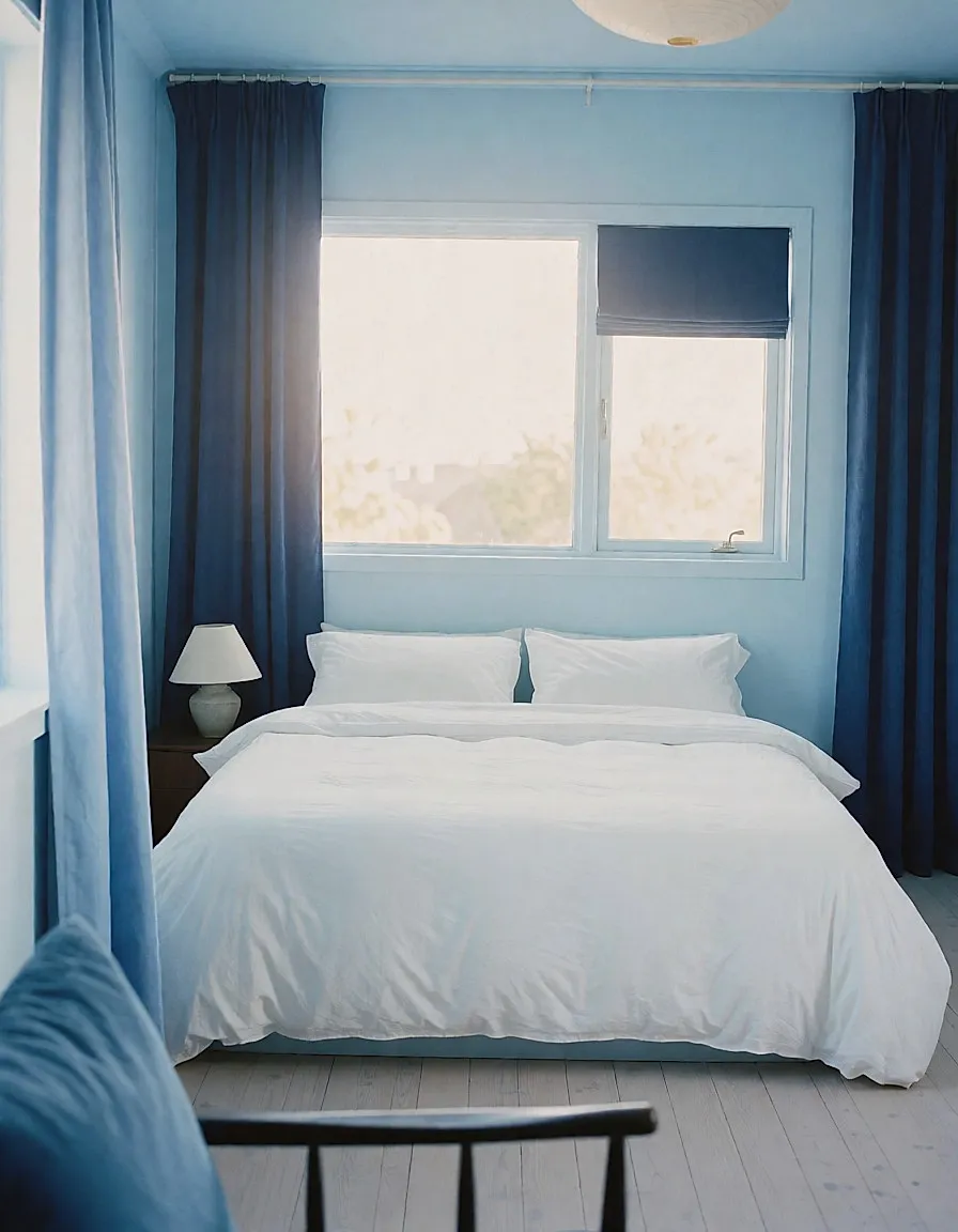
Blue evokes sky, sea and calm — it also carries a symbolism of faith. Its range is huge: sky blue, royal blue, blue-violet, lavender... But overall it's a calm colour, one that makes a room feel spacious and open.
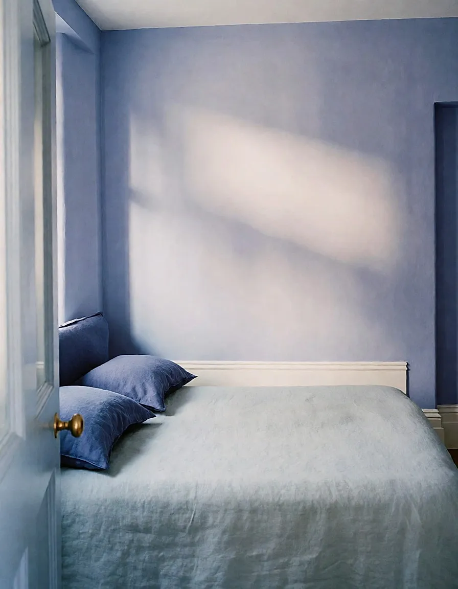
That's why it works so well in bedrooms, where it creates a serene atmosphere, and in bathrooms, where its link to water feels obvious. A very pale blue looks lovely with darker curtains, and vice versa.
Pink: the softness that warms
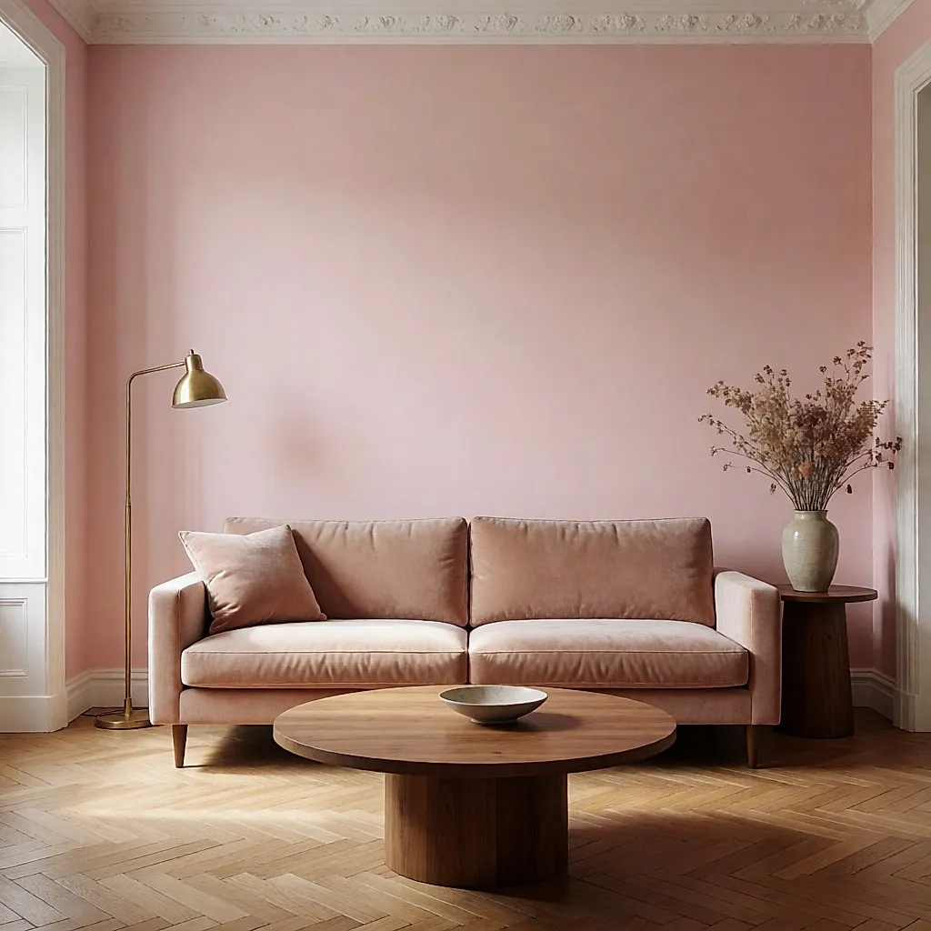
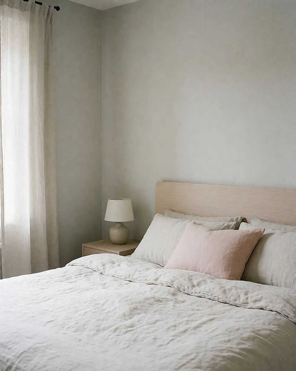
Pink symbolises femininity, romance and gentleness. It's a delicate colour, both warm and soft. It appears a lot in bedrooms and bathrooms: it warms and lightens without ceasing to be a 'calm' colour. That's why it works just as well in a baby's room as in an adult's bedroom. From pale pink to raspberry, you can play with intensity within the same space.
Green: nature indoors
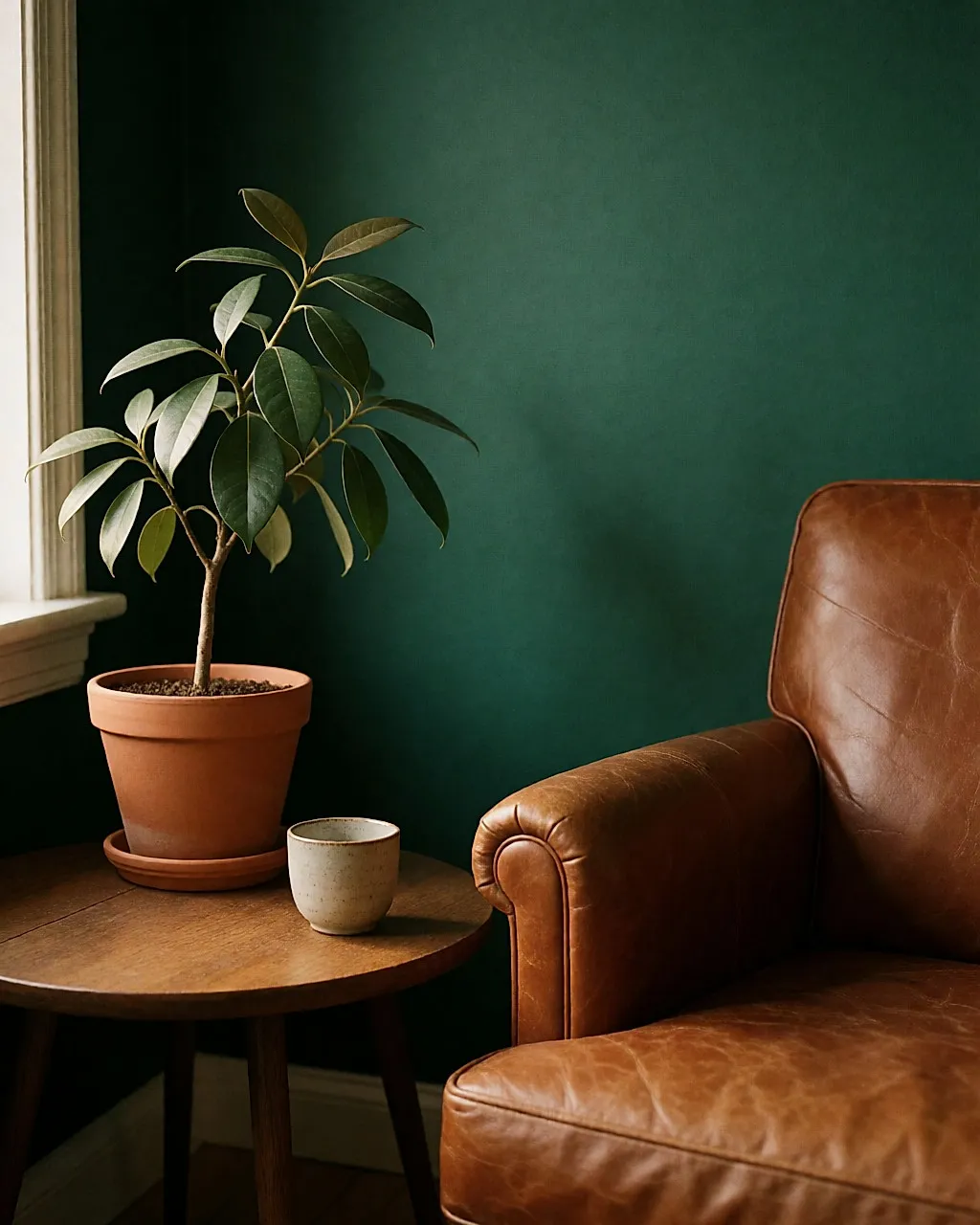
Green represents nature, vegetation, the wild — and the cycle of life. It's a cool colour, again with a whole spectrum: from pale green to emerald, by way of aqua.
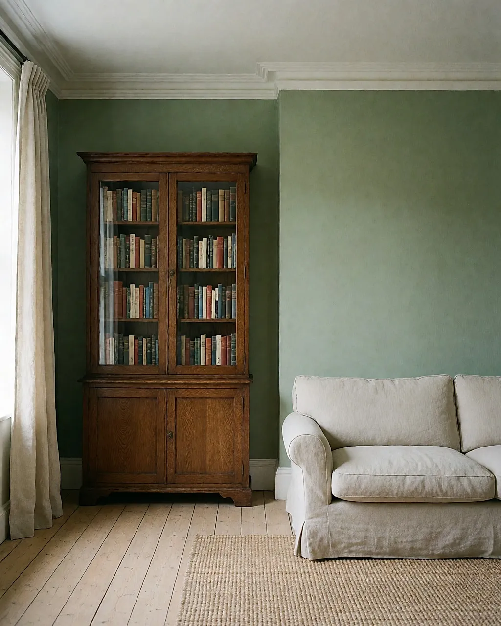
Relaxing and calm, it's widely used in offices, libraries and workplaces, because it's believed to help concentration. It also pairs beautifully with wood, dark or light: the atmosphere becomes refined and pleasant.
Grey: understated and chic, depending on the pairing
Grey is a calm, sophisticated colour. Depending on the shades you pair it with, it can give a room a peaceful, chic look, or a warm and elegant mood. It all depends on the effect you want: pale pink for a peaceful, pretty room; midnight blue for an elegant, imposing one.

Purple: a touch of nobility
Purple, a symbol of nobility, changes effect greatly depending on its shade. A wisteria purple will give a room a cool, peaceful feel; lilac will add character and a warm atmosphere — perfect alongside a wooden staircase, since purple and woodwork make a magnificent pairing.
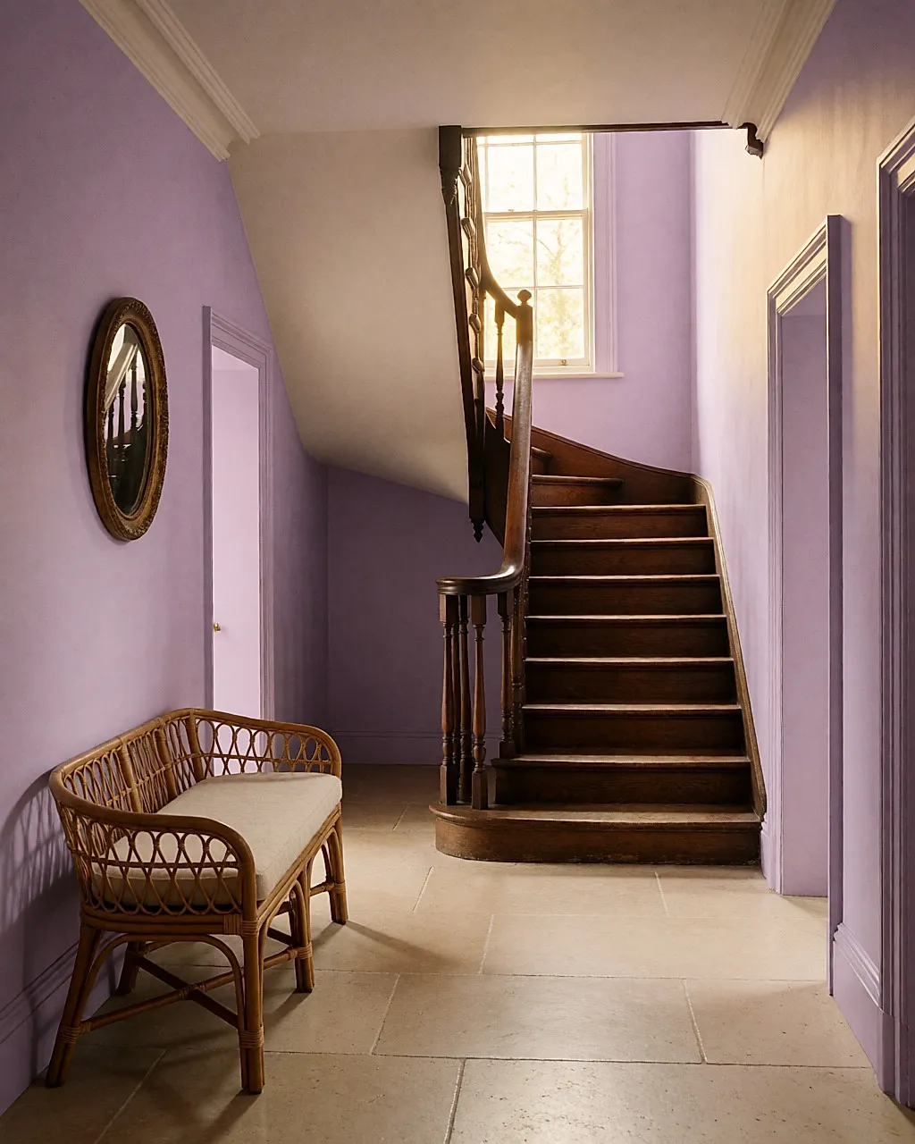
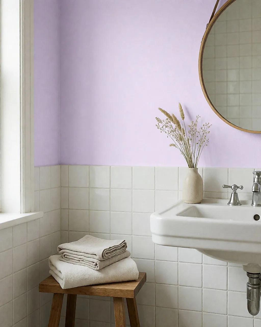
In the end, choosing colours is never a minor detail: from one shade to the next, the whole atmosphere shifts, and a room can change its face. There's no rule to follow to the letter — what matters is picking the shade that suits the atmosphere you want, room by room, and giving yourself time to see how it behaves in your own light before committing to the whole wall.
Before you repaint, think about the air you breathe. Open windows wide during and after decorating, and choose paints labelled low in volatile organic compounds (VOCs). Pregnant women and young children should stay out of the room until it is thoroughly dry and aired. If in doubt, speak to your GP or pharmacist.
Budget
Cost-wise, doing the painting yourself is still the most affordable option. As a guide, expect to pay around £20 to £45 for a 2.5 L tin of decent mid-range wall paint, and £45 to £85 for a premium paint that's more opaque and hard-wearing. The price varies with finish — matt, satin, washable — environmental label and brand.
A 2.5 L tin usually covers 25 to 35 m² in one coat, and you'll often need two coats for a dramatic colour change: so buy a little more than the exact area of your walls. If you'd rather hand the job over, a decorator often charges around £18 to £35 per m², plus materials; the rate depends on the region, the condition of the walls and the number of coats needed.
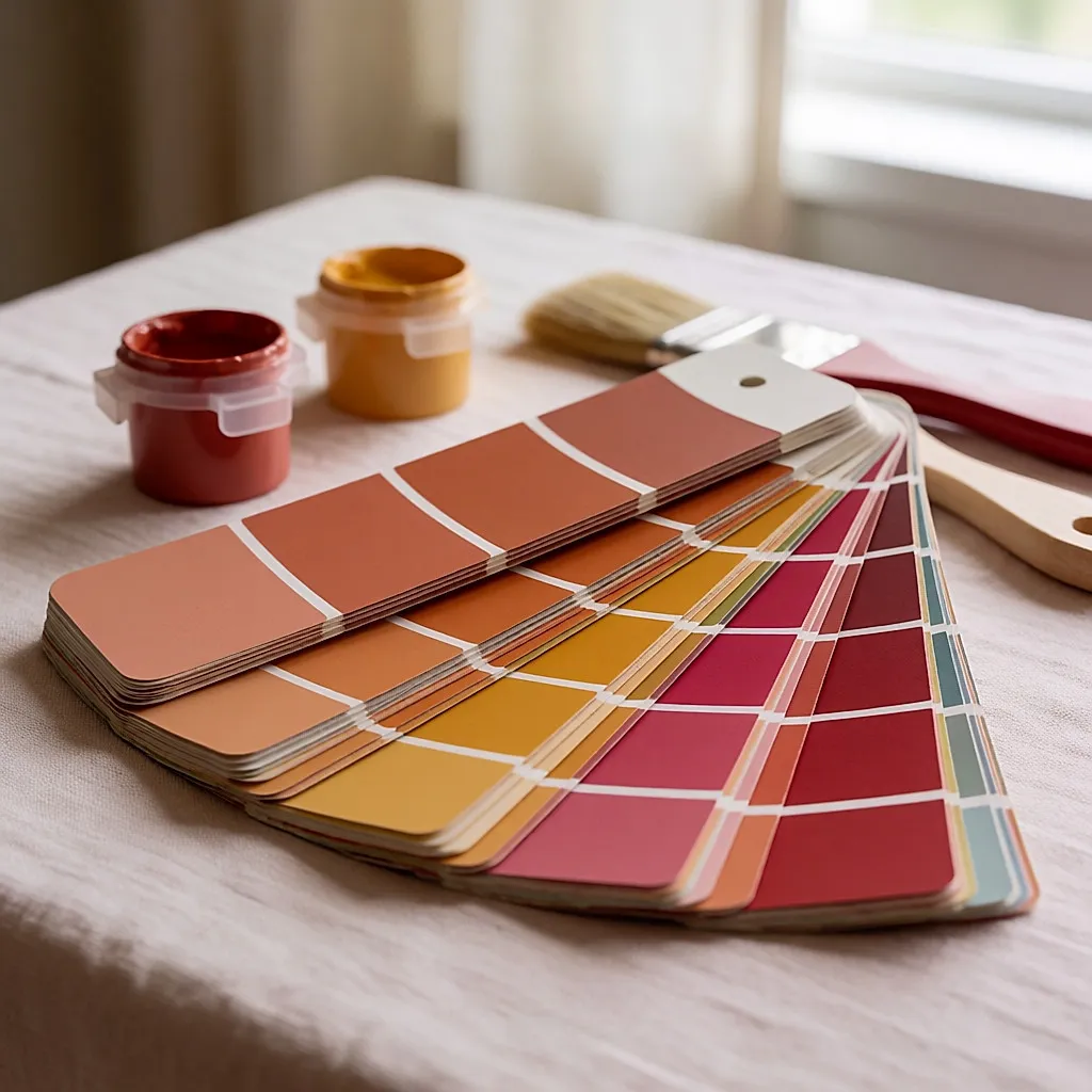
Test pots of 0.5 L, sold for a few pounds, are probably the best investment in the whole project: they let you try a shade on a wall, at different times of day, before committing. Where to find everything? Large DIY stores for budget ranges and common brands, specialist paint shops for advice and technical ranges, and online for colours that are hard to find locally. Household waste recycling centres and reuse shops sometimes resell leftover pots: it costs nothing to take a look.
And what about the eco side? Paints carrying the EU Ecolabel or other independently verified low-VOC certifications meet a specification that limits VOC content: that's a more solid guide than a 'natural' claim printed on the label. Clay, lime and plant-binder paints are another option; they let walls breathe more, but they're often more expensive, less washable and need a bit of skill. It's up to you to decide what matters most, depending on the room and how it's used.
Sources
- NHS: advice on sleep and the bedroom environment.
- NICE: guidance on indoor air quality at home.
- UKHSA: information on volatile organic compounds (VOCs) and indoor air quality.

Comments
Your opinion matters: rate the article, react and reply to comments.
Comments are moderated; AI-assisted comments are flagged. Text emoticons (8-), :-), <3…) are automatically shown as images.