

You pull a checked shirt on in the fitting room. On the hanger, the cut is perfect, the pattern crisp, the drape impeccable. On you? Instant pyjama effect. Has that happened to you? It has to us too, and the cause is almost always the same: the scale of the print, its density or its contrast is off. Because a print isn’t chosen by feel — it’s checked.
What's coming back this season
Checks first — tartan, Prince of Wales or houndstooth — often cut in wool flannel or tweed whose matte drape gives structure to the silhouette instead of swamping it. Leopard comes next, but in a softer version, beige on brown, far from the aggressive big cat of years past. We’re also seeing dense florals, like interior upholstery, and wide or broken stripes that break the line without blurring it.

The common thread between all these autumn prints? They’re not purely decorative designs — they have texture. The fabric does half the work, the pattern does the other, and that’s probably what makes them easier to wear than a summer print.
Scale: the first thing to check for your shape
It’s the rule that changes everything, and the one we forget most often. The taller or broader your silhouette, the more easily it carries a large motif. The smaller you are, the more the design needs to shrink. An XXL check on a fine frame doesn’t dress it — it swallows it. Conversely, a tiny motif on a larger line reads as background noise, a fizz with no intention.

One nuance matters, though: a large pattern with low contrast, in camel and brown tonal shades for example, works on almost everyone. In other words, it’s contrast that carries visual weight, more than the size of the design alone.
Density and contrast: the three steps that save you
Next, look at density. A tight, very full design weighs far more than an airy motif on a plain background. The right move takes three seconds and is remarkably effective: you step three paces back from the mirror and squint. If all that’s left is a shapeless blob, it’s too dense for a top. On a skirt or trousers, you can allow a little more generosity — the eye rests there less.

Contrast with your skin matters most above the waist. A print that dulls your complexion is obvious straight away: grey pallor, shadows standing out, tired features. In that case, keep it for the bottom — skirt, trousers — and balance it with a solid that revives the face.
How many prints can coexist?
One is enough in most cases. It’s the classic mistake: piling on checks, stripes and florals because each piece is lovely on its own. In reality, two prints maximum, and only on one strict condition — clearly different scales. Fine stripe with large check, it works without argument. Medium floral with medium houndstooth, and the two compete for attention.

A total print look is still possible: same colour base, same scale, one piece carrying the print across the whole outfit. The rest of the wardrobe then needs to be really calm, almost silent, to let the look breathe.
How to calm the rest
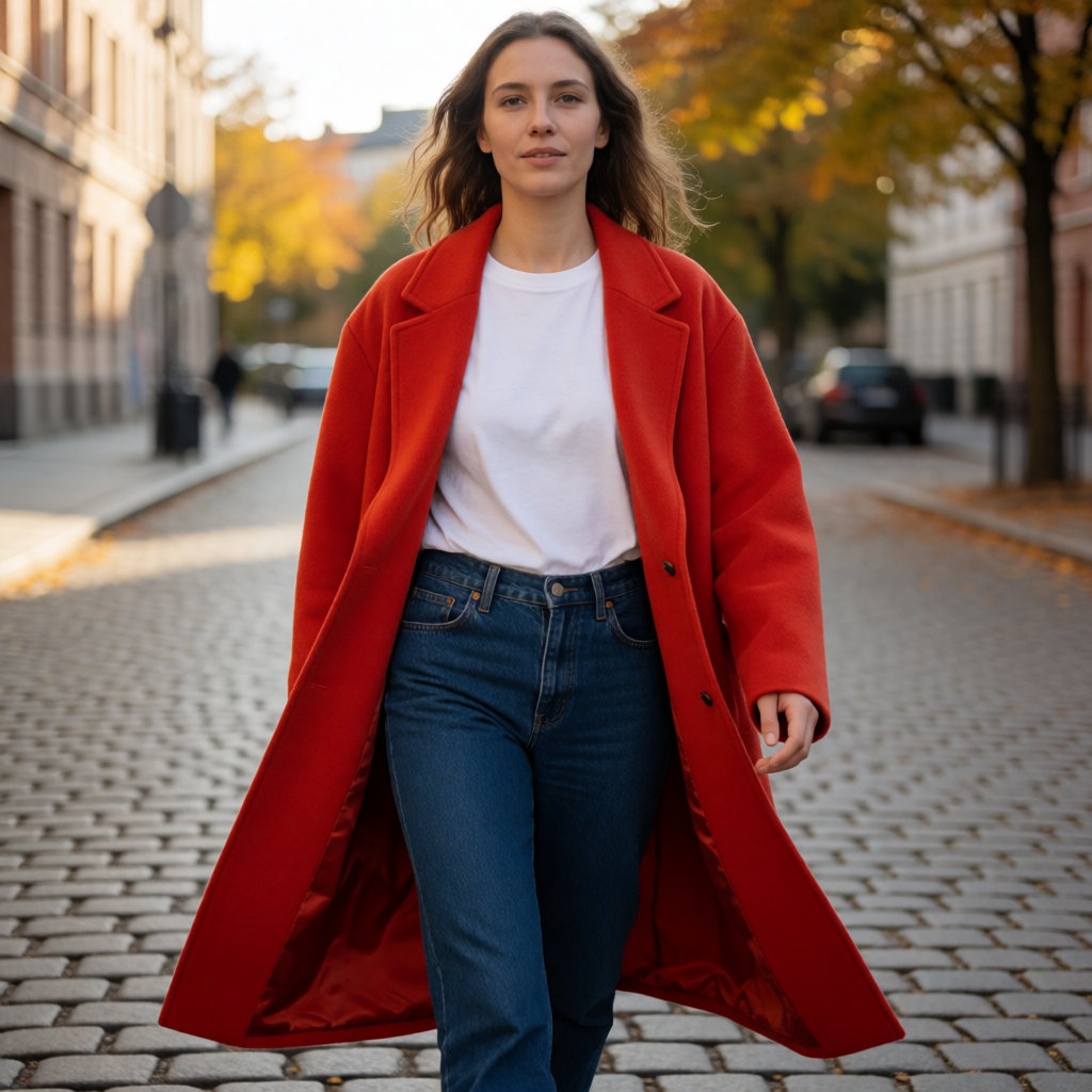
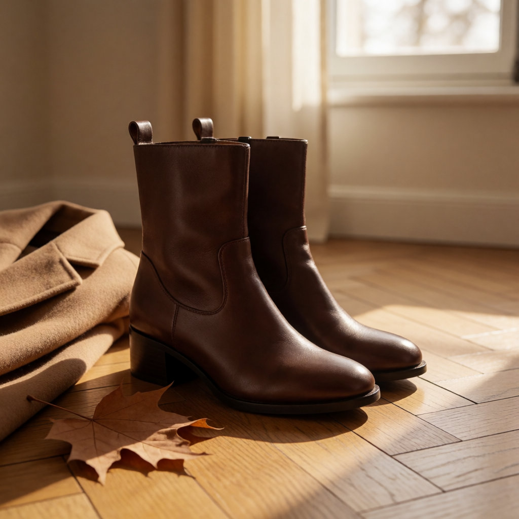
For a print to become your statement piece, it needs silence around it. Plain knitwear, raw denim, smooth leather, leather boots: basics with no pattern that let the eye rest, full stop. Layering helps enormously — a print slipped under a plain blazer, and the blazer frames the pattern, holds it, stops it from spilling over.
A simple benchmark: ask yourself what you see first when you look in the mirror. If two things are competing, take one away. That’s often the right decision.
Pattern alignment: the test nobody does
Last test, technical, and the one almost nobody does in the fitting room. At the seams, the pattern should line up — side seams, centre front, armholes, pockets. On a shirt, the design continues along the button placket. At the back, it joins neatly at the armholes. A pattern that breaks at the seam is noticeable from three metres away, even if you don’t know why it bothers you.
Pattern matching uses more fabric: more is cut to align the joins correctly. That’s why a well-matched piece costs more than one cut to save fabric — and it shows when worn, in the seam and the drape.
Budget
On the budget side, expect around £35 to £85 for a printed cotton or viscose shirt, £50 to £150 for a jacquard knit or patterned cardigan, £70 to £220 for a dress, and £130 to £430 for a wool checked coat. In charity shops, re-use shops or markets, you’ll often pay between £10 and £35, with a more random choice but older fabrics that still hold up very well — a good find when you come across a real tweed.
What makes the price vary? Fabric first — real wool versus synthetic blend, the drape is completely different. Then pattern matching, the range, and care: a dry-clean-only piece costs more to wear than a washable cotton, so think about that before buying. In department stores and multi-brand online shops, you’ll find the same families of prints at very uneven levels of finish. The real arbiter remains the drape: a piece that hangs badly is never worth its price, whatever it is.
So, next time you try on a print in the fitting room, remember these pointers: scale first, density next, contrast with your face, and pattern matching at the seams last. You’ll see — the pyjama effect soon fades when your eye knows what to look for!


Comments
Your opinion matters: rate the article, react and reply to comments.
Comments are moderated; AI-assisted comments are flagged. Text emoticons (8-), :-), <3…) are automatically shown as images.